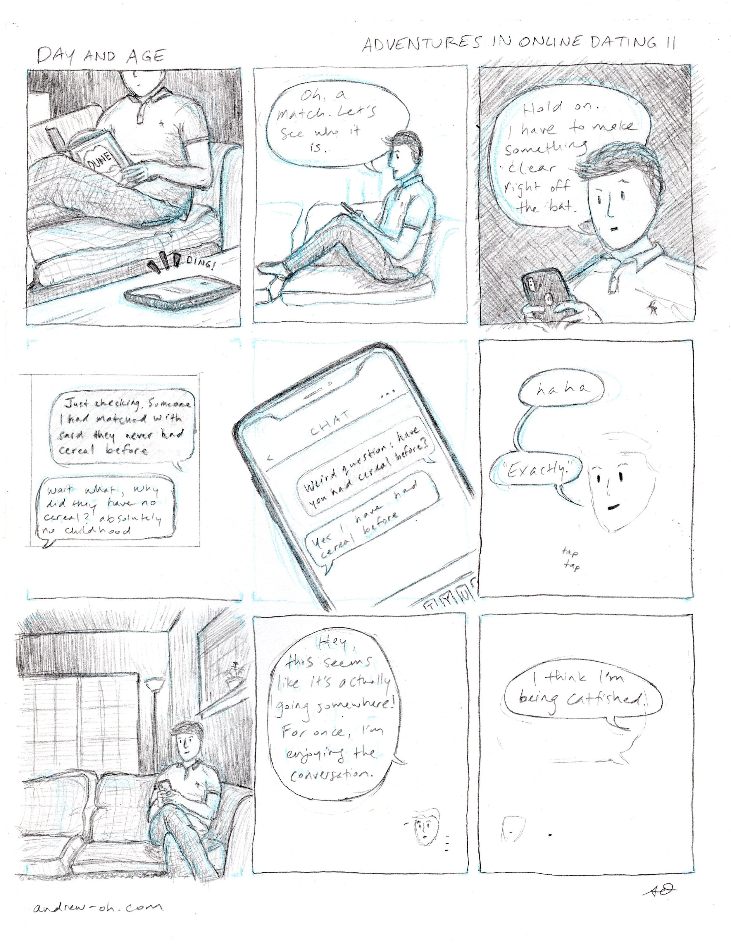
Script for D&A #7
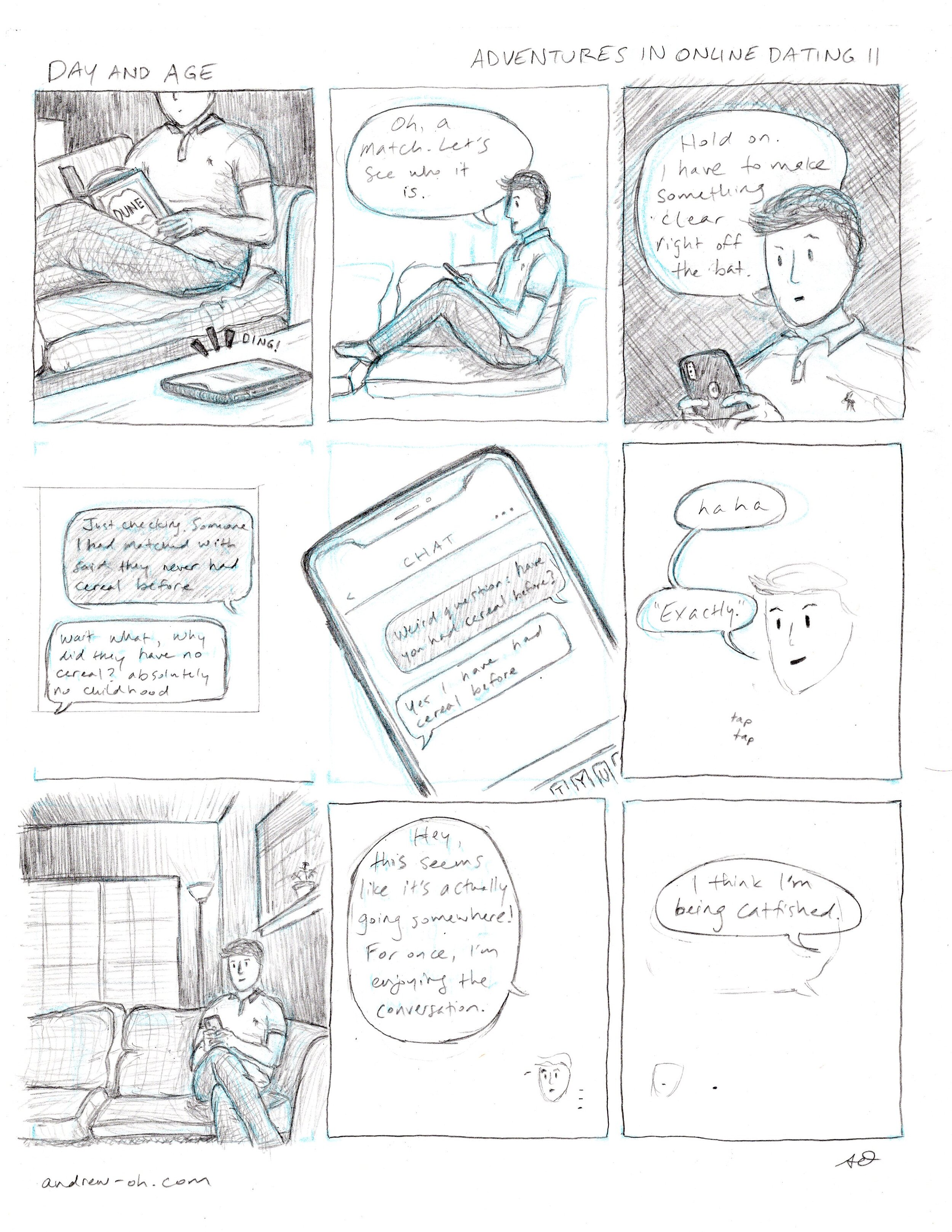
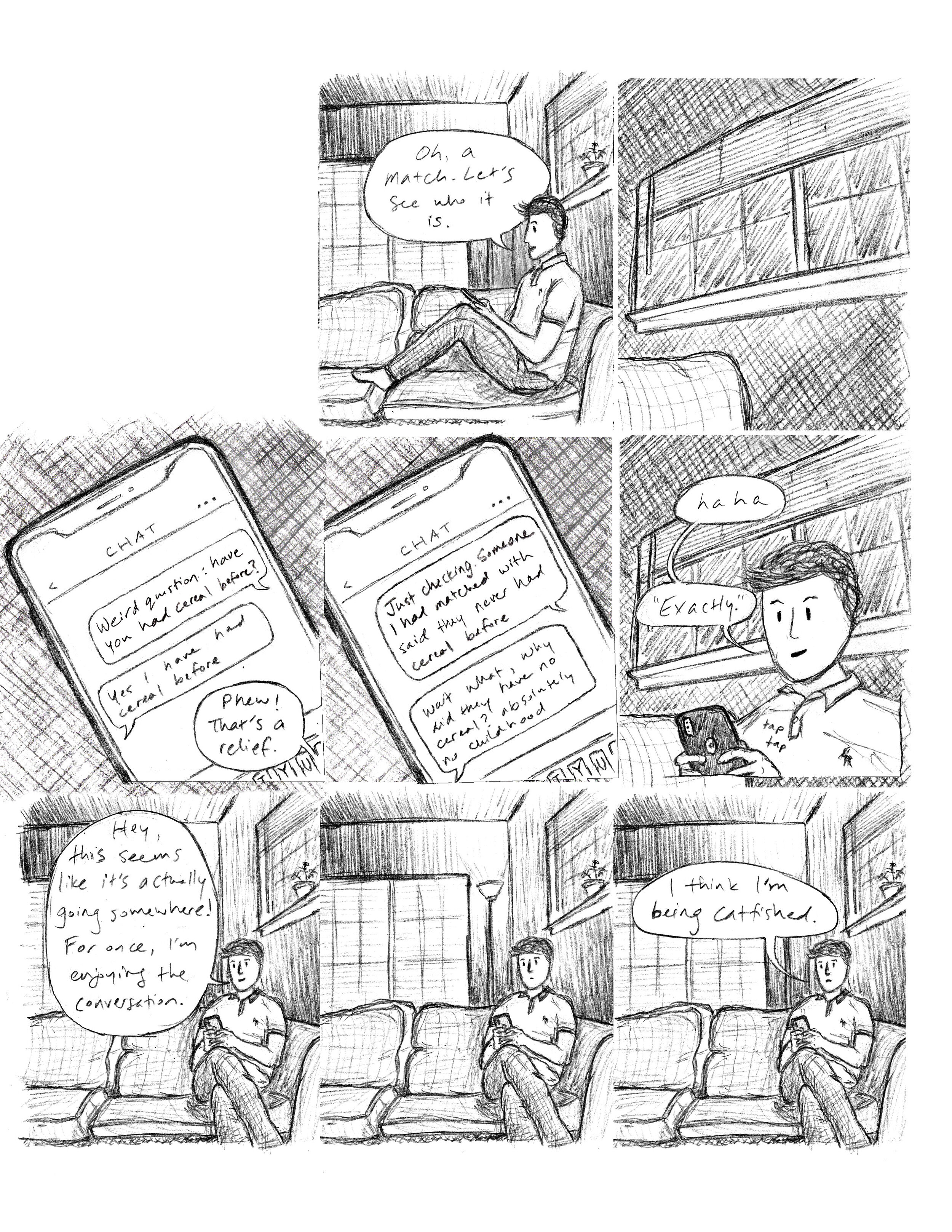
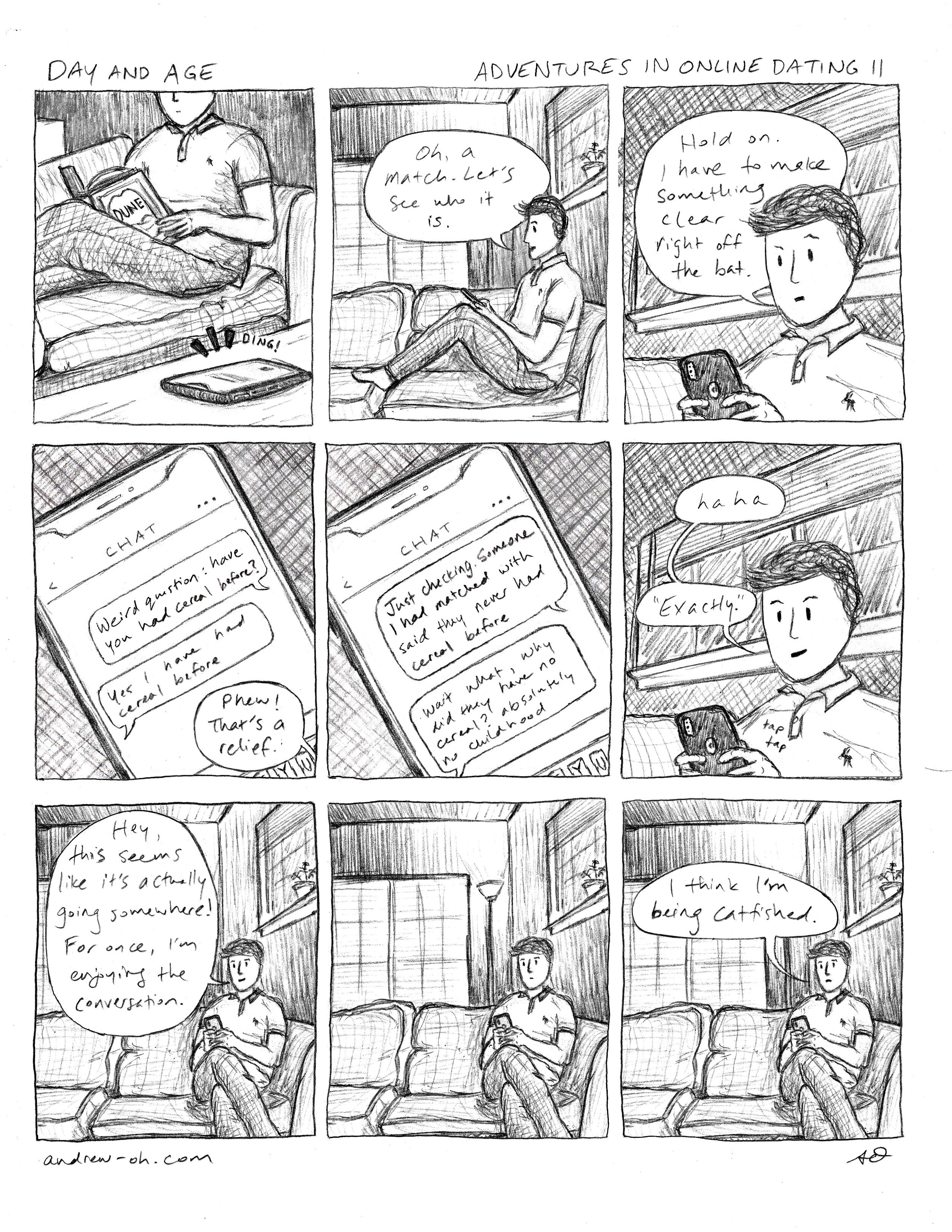
Much like my track record with online dating thus far, the creation of this comic was something of a disaster. Well, not completely, otherwise there wouldn’t be a comic to show. The culprit was the most storied of fatal flaws: hubris. I had gotten complacent and cocky, and figured I didn’t have to sufficiently plan out my comic before diving in. I committed the cardinal sin of film set decision-making (and as a filmmaker, this makes it particularly painful): let’s fix it in post. To be fair, I was not entirely wrong. I did, indeed, fix everything in post. But oh boy, were there a ridiculous number of issues that needed fixing - and nearly all of them were entirely avoidable.
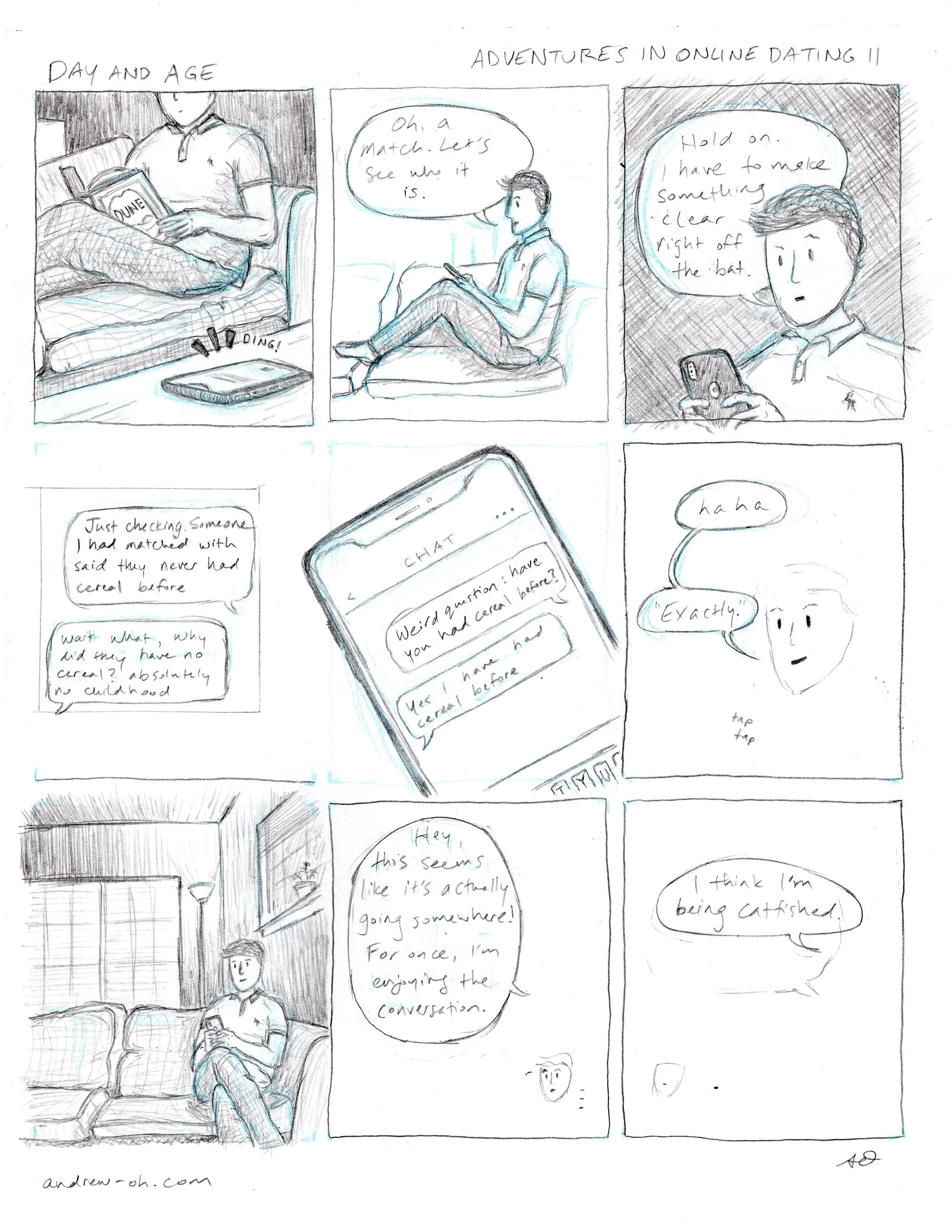
In general, my scripting process has always been very loose. It’s for my reference only, so unlike a film script or recipe, it does not need to make sense to other people. In addition, since I work on only one comic at a time, some details I’m able to refrain from printing and simply retain in my working memory. I make layouts to see how I can fit the story in my head into a maximum of nine squares. Once I have a gist of what goes where, that’s usually enough for me to go on ahead and start sketching. Usually this isn’t an issue…
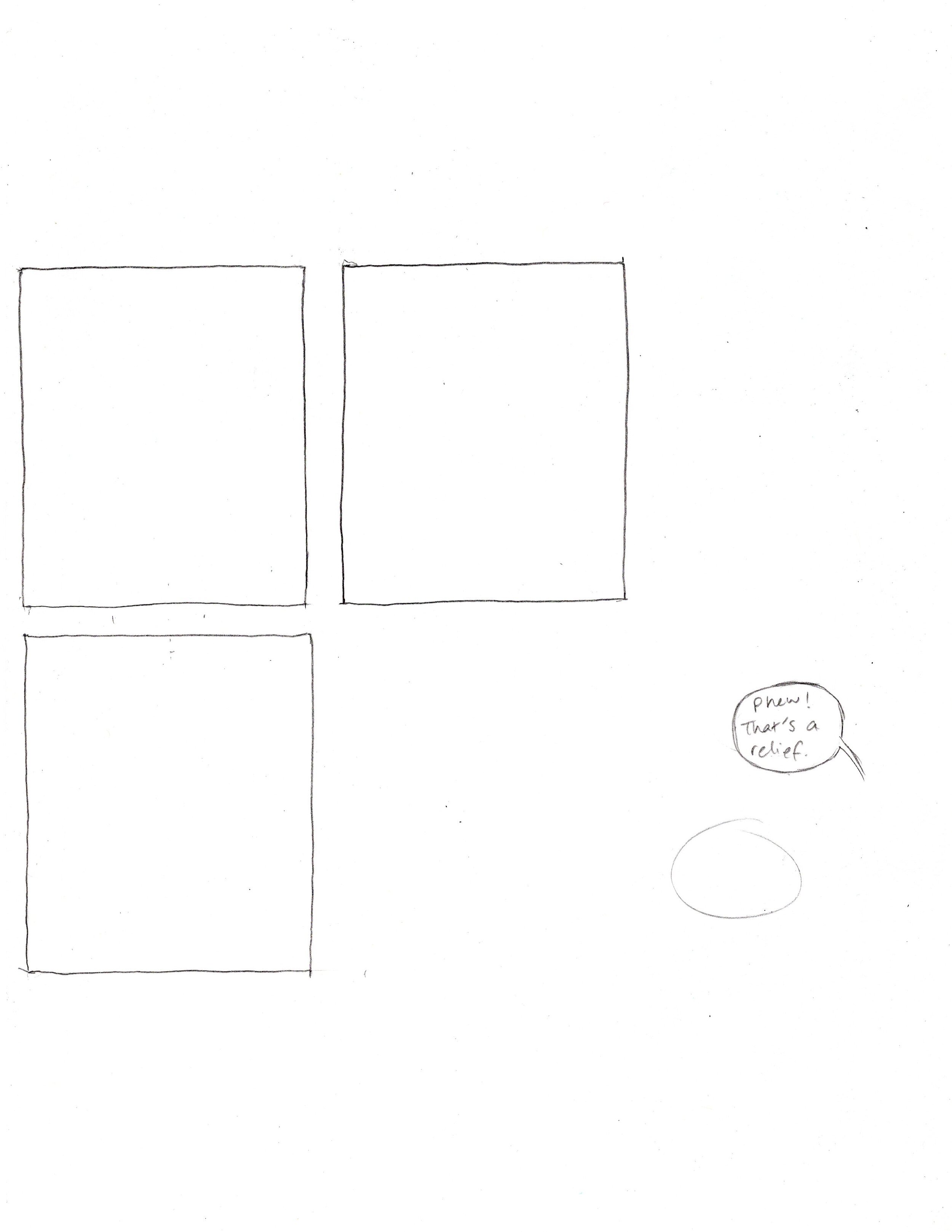
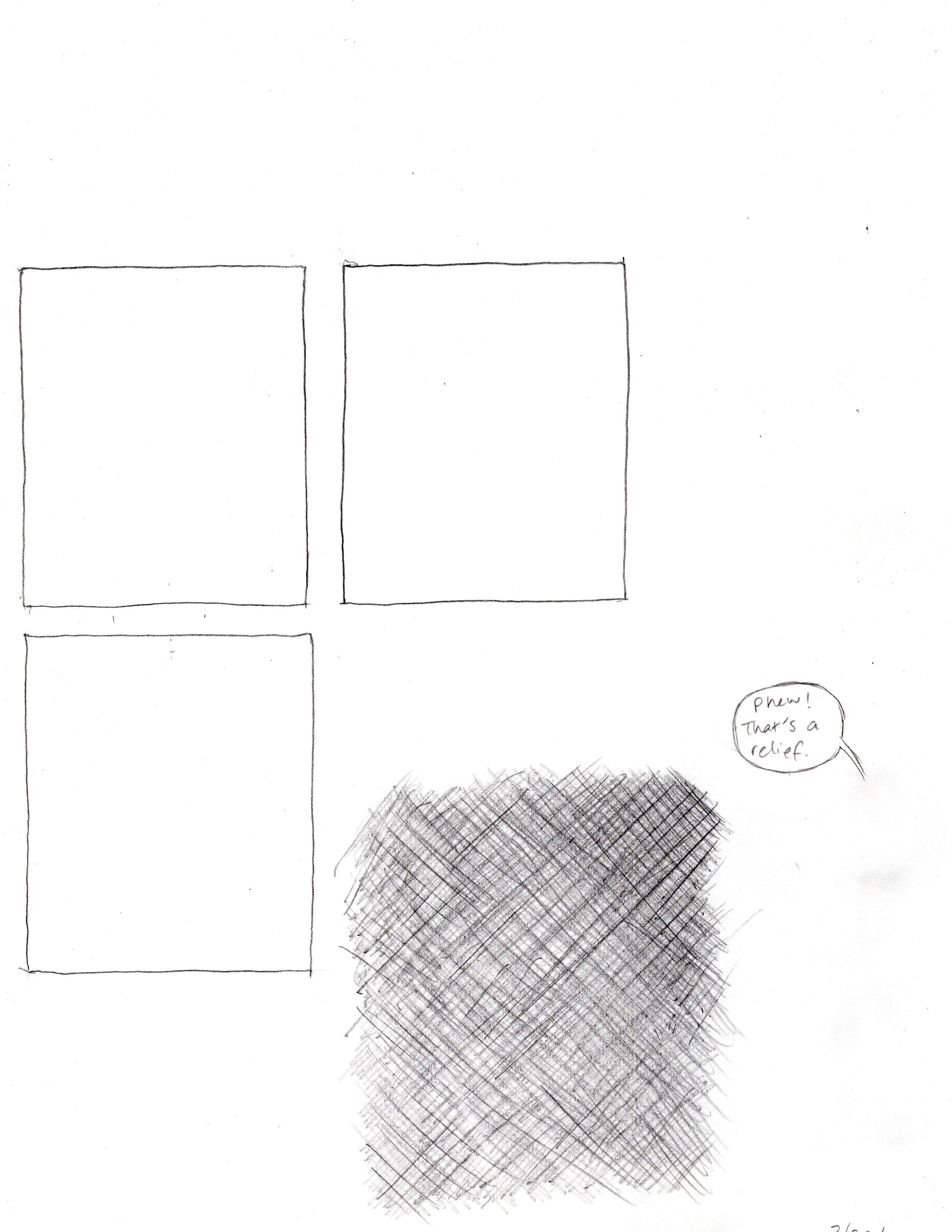
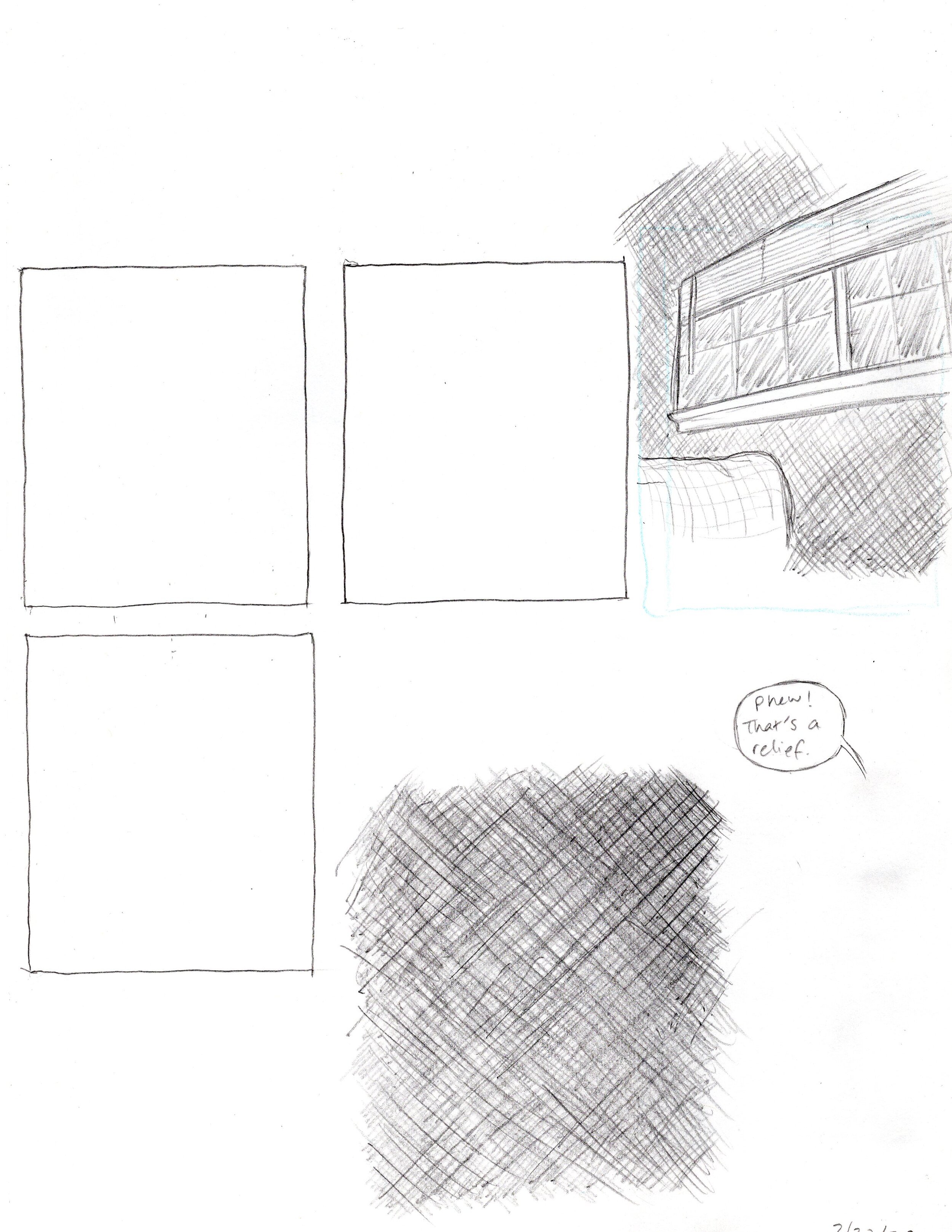
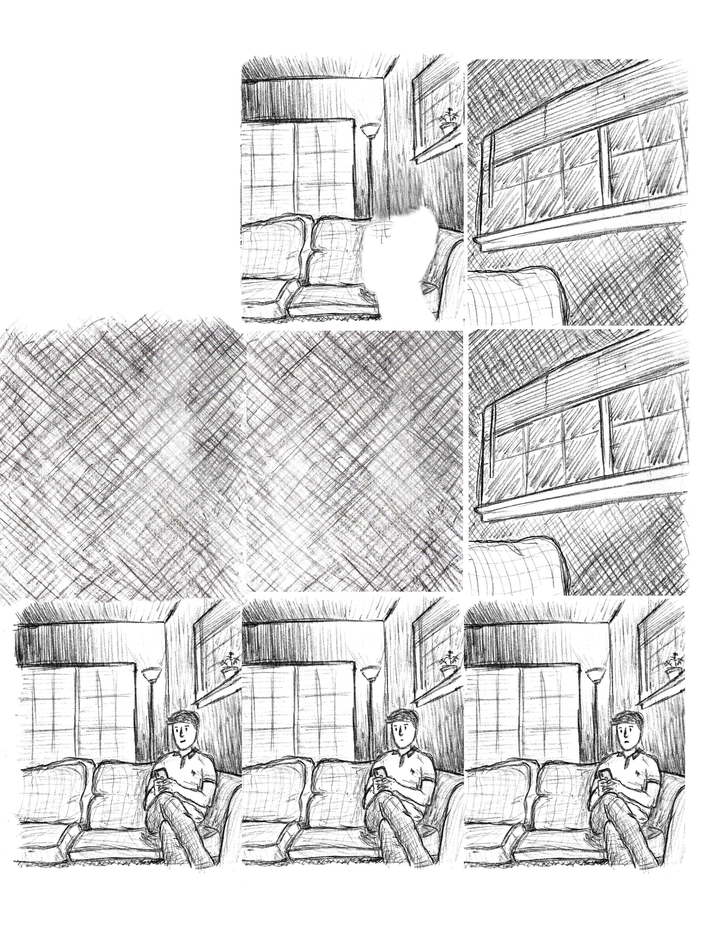
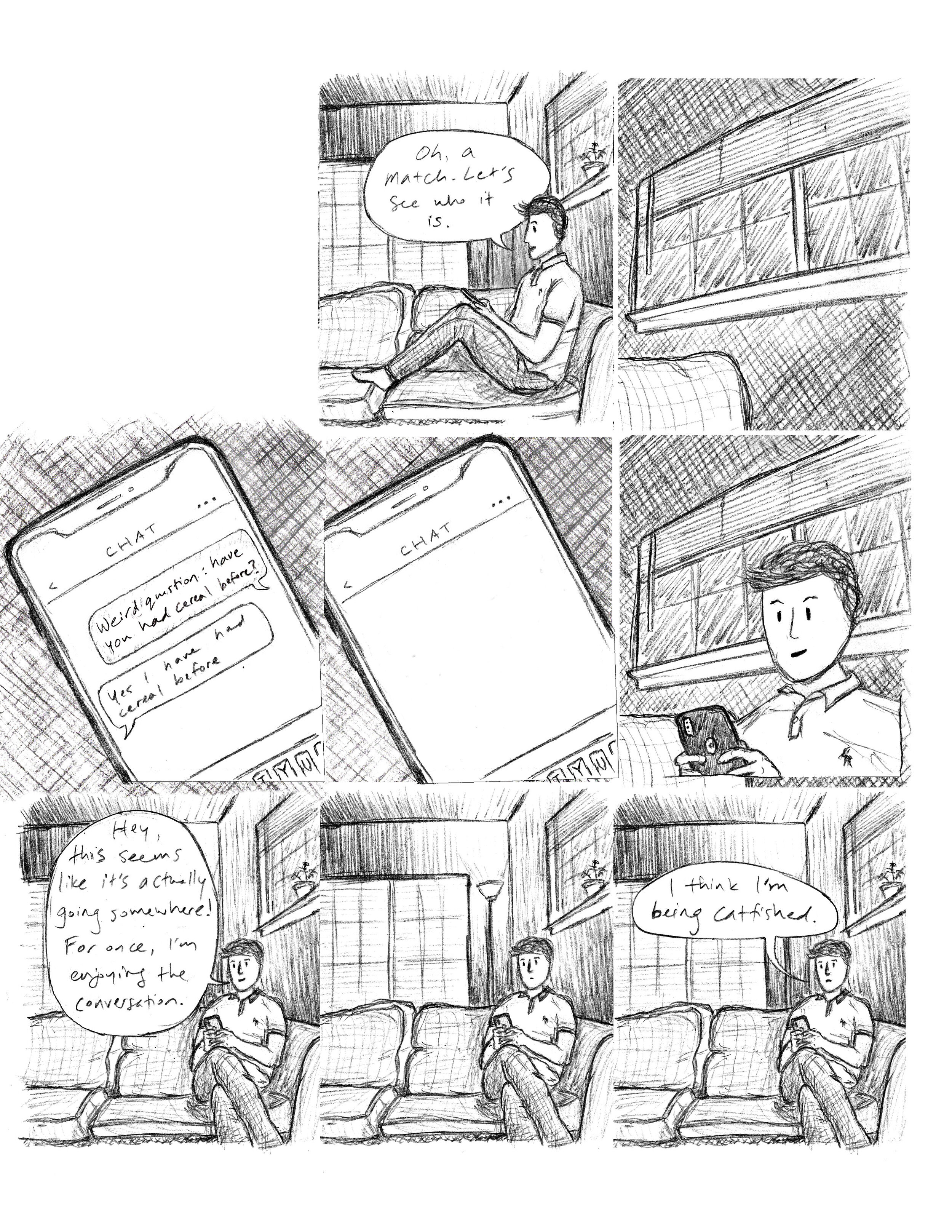
As I’ve made more comics for Day and Age, I’ve gotten more comfortable with digital editing and being aware of what would be better to do in GIMP rather than on paper. And that should have been my directive: would this part of the comic turn out better if I did it physically or digitally? Unfortunately on D&A #7, my MO was “how can I save time by making my comic digitally?” More blatantly: “how can I use GIMP to do less work?” I ended up deferring way too much of the comic to a future Andrew, with his laptop and tablet and many, many regrets.
Usually, I have two editing layers when I’m finishing a comic, but this one had four. In my head, I figured that any panels with repeating frames or backgrounds would be a cinch. Just copy and paste, copy and paste. But I didn’t plan for that process. I didn’t make backgrounds that would easily reproduce (or I just straight-up forgot). I had trouble resizing foreground objects to fit the copied background because I didn’t measure them out on paper. In the end, I may have done more work than if I had just drawn each panel individually by hand. The home stretch was frustrating because at every step, I knew what I should have done earlier to have obviated my current burdens. And I don’t know if this comes off to the average reader, but to me, this comic feels factitious. There’s no flow to it all - it just doesn’t feel right. Every panel has at least some part that feels manipulated and digitally touched, and it loses the tangibility that I’m striving for. It’s the reason I enjoy using pencil and why I shade the way I do. Going forward, I need to do better and I know that I can. I just have to remind myself: don’t cut corners - especially with a cropping tool!

